AIS house
  • HOME
  • AI do
  • as dAIS go by
  • DIY Links

DIY: FENG SHUI-APPROVED BUSINESS LOGO

8/6/2012

0 Comments

 
Picture
(photo from logoonlinepros) 
In case you guys are wondering what I've been up to lately enough to seemingly neglect my blog is because A and I have been busy establishing his business.

Coming up with a business name along with its other visual paraphernalia (logo, business cards, letterhead, etc.) actually calls for a lot of critical thinking.  
A business name and logo are the major identity marks of an entity. It's what's going to set a business apart from the others. Logo Online Pros offer valuable tips on how to design your logo.
Some logos change as a sign of growth. Take SM-Shoemart for example. The business started with selling shoes. Thus, the name ShoeMart ("SM"). Since its beginnings in 1946, SM has expanded into distributing other items aside from shoes. The name SM no longer represents what the whole business can offer. So, they changed the logo into what we're familiar with while maintaining the color and font style of the original one.
Picture
then
(photo from designKULTUR)
Picture
now
Did you know that some establishments apply Feng Shui elements in the design of their logos?  

SM, if you've noticed is written in a continuous script. Look at the current logo. The letters "S" and "M" are joined together at the bottom curve of the letter "S." In feng shui, it signifies continuity (longevity) of the business  because the manner in which the name is written doesn't stop. I'm not sure of the choice of colors though if feng shui was a factor. It most probably has considering Henry Sy is Chinese. 

Let's try looking at a couple more.
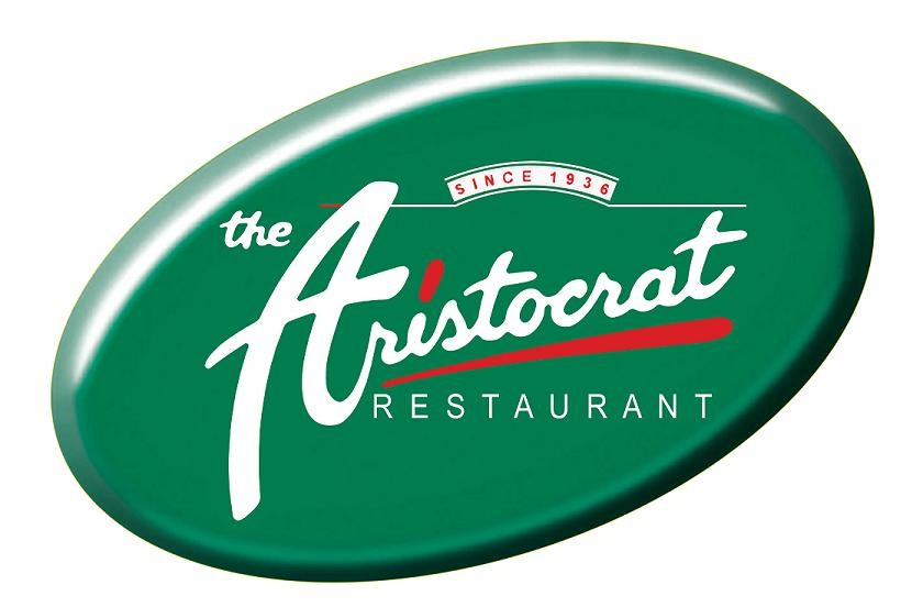
Aristocrat Restaurant has been renowned for 75 years now and has been the mother of other food establishments such as Alex III, Serye, Reyes Barbecue, and Mama Sita's. I'm just familiar with it from my childhood as it occupies this massive area in Manila. Haven't really gone around to try it before as my family would go to Max's. I was only able to try it after it had a facelift and found the place enticing to go into. Anyway, back to logo analysis...
Picture
then 
(photo from This Old House)
Picture
now
Like SM, the main business name have letters that are written in a continuous script. In the new logo, 2 major adjustments were made: The "Aristocrat" name was inclined and red accents were added (both inclining as well). This was done to symbolize growth (upward movement) of the business. Red was added into the logo because of the nature of the business - restaurant, which is a fire element. The green oval has both branding and feng shui elements behind it (I think). The original color of the "Aristocrat" text was green. The restaurant has been running since 1936. The image is already implanted in the minds of its consumers. Not advisable to make too much of a drastic change in the logo design. Retaining the dominant green color (eventhough the name was changed to white) keeps the top-of-mind identity intact. Feng shui-wise, green is a wood color. Fire and wood elements work best for a restaurant business since we use fire and wood to cook. At least, that's how the feng shui concept goes.

As the business expanded, Aristocrat's sister firms have adopted the new logo concept while having their own logo identity:
Picture
Aristocrat Bakeshop
Picture
Culinary Institute of Aristocrat
Aristocrat Bakeshop may not have the red accent, but it's surrounded in gold (yellow) which is also a fire element color. By the way, we have the same geomancer.

Now, let's tackle the one that is close to my heart - Smart. It was during my stay here that I've been exposed to a number of business feng shui practices. Logo design is one of them. I've seen the logo change twice.

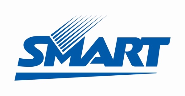
If I remember it correctly, the original logo (pre-MVP) looked like the one on the left below, sans the accent at the bottom of "SMART." Blue is the color for telcos. Common denominator with the logos of the first 2 logos that we've discussed, the text is continuous. There was a time that somebody designed the logo that separated all letters and all hell broke lose to whoever did that. Lesson learned: logos are not to be played with until one checks with the geomancer first and DO NOT SEPARATE THE LETTERS OF THE LOGO NAME.
Picture
Picture
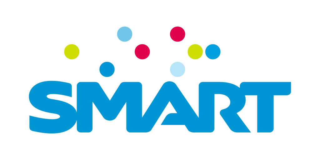
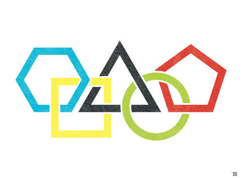
The new logo took out the accents, but introduced a new aspect: the five elements.
Picture
According to our geomancer, the presence of the five elements will protect you against any element that may be working against you at any given time. 

With all these considerations in mind, it's time to design our own logo by checking first with our geomancer. 

1. Since the nature of the business is general merchandise, the color should be orange. 

2. With the nature of the business, one can sell almost anything and everything. So, the name of the business must not be constrictive. It should entice growth and be dynamic.

3. Use a continuous script

4. Add in the five elements on top of the name

5. Work hard

6. Pray

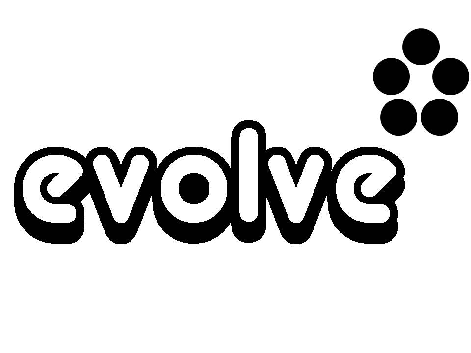
After taking all of that in, we ended up with this:
Picture
Picture
monochrome logo for the receipts
Picture
back side of the business card 

0 Comments


Leave a Reply.

    popular post
    Picture
    DIY Hermes Paper Bag

    Archives

    May 2015
    April 2015
    March 2015
    January 2015
    December 2014
    August 2014
    June 2014
    May 2014
    April 2014
    March 2014
    February 2014
    November 2013
    October 2013
    June 2013
    January 2013
    December 2012
    November 2012
    October 2012
    September 2012
    August 2012
    July 2012
    June 2012
    May 2012
    April 2012
    March 2012
    February 2012
    January 2012
    December 2011
    November 2011
    October 2011
    September 2011
    August 2011
    July 2011
    June 2011
    May 2011
    April 2011
    May 2009
    December 2008

    Categories

    All
    Ais Mum
    Dining Out
    Diy
    Etcs
    Fab U Less Finds
    Fab-u-less Finds
    Fab-u-less Finds
    Freebie Find
    Gratitudes
    Home Cooking
    Ingredient Substitutes
    Movies
    Musings
    Nablopomo
    Nest Building
    Pastries
    Recipes
    Shop Finds

    my daily company

    Recipe Girl
    Kitchen Wench

    Sandwich Pro

    Bake Happy
    The "Pro" Files
    Your Japanese Kitchen
    Closet Cooking

    BlogHer.com Logo
Powered by Create your own unique website with customizable templates.